
Redesigning the MployChek Candidate Flow
MployChek is a pioneering company that leverages blockchain technology to revolutionise the background verification process. As a key member of the UX team, I was tasked with redesigning the self-initiated candidate flow - a crucial touchpoint where individuals interact with MployChek's services to verify their credentials for employment or education purposes.


Project Type
Internship Project
Time frame
5 weeks
Tools Used
The Problem
The old MployChek website presented a one-size-fits-all candidate flow, regardless of whether an individual was visiting the website to get their credentials verified on their own initiative, or if they were doing so because a recruiter had asked them to get their credentials verified. Feedback from candidates revealed that this generic approach was confusing and frustrating, leading to a high drop-off rate among self-initiated users.
The Goal
The goal of this project was to redesign the user flow for self-initiated candidates. By simplifying and optimising this self-initiated path, the aim was to create a more tailored and user-friendly experience that would ultimately drive down the high drop-off rates observed in the previous generic flow.
Process: Research and Exploration
User interviews
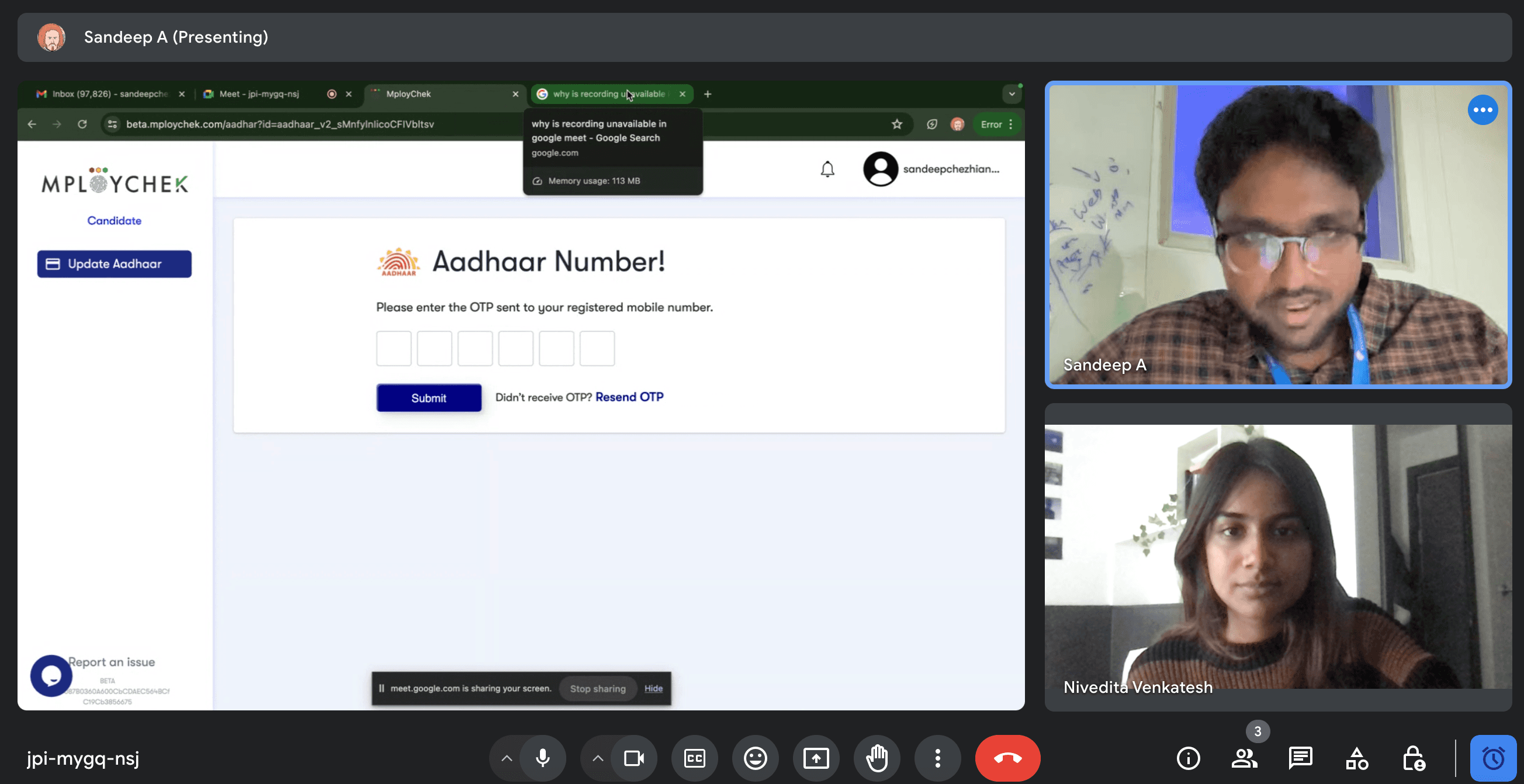
I conducted two user interviews over Zoom, asking participants to navigate through the old, one-size-fits-all flow while sharing their screens and thinking out loud. I took note of their pain points and frustrations in detail in this Google Doc

There were two broad takeaways:
Several section headings and buttons were confusing or misleading
Time was wasted trying to figure out if a certain task had been completed
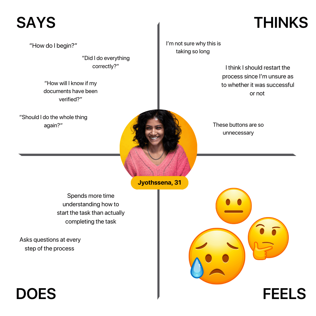
Empathy mapping
The general user experience was "confusing", "frustrating" and "anxiety-inducing". I created two empathy maps based on my interviews to better understand my user's thoughts and feelings throughout the process.

Considerations at this stage
I shared my takeaways from the interviews with the project manager and we discussed how the redesigned user flow was meant to align with the business and developer requirements. There were three things to keep in mind while creating the new flow:
1. The brand identity of the business had to be maintained (same font, colours etc.) to ensure consistency across the self-initiated and recruiter-initiated flow
2. The new flow had to be simple and easy to understand, thus reducing the need for new users to have to contact customer support with UI-related issues or queries so that these resources could be diverted elsewhere.
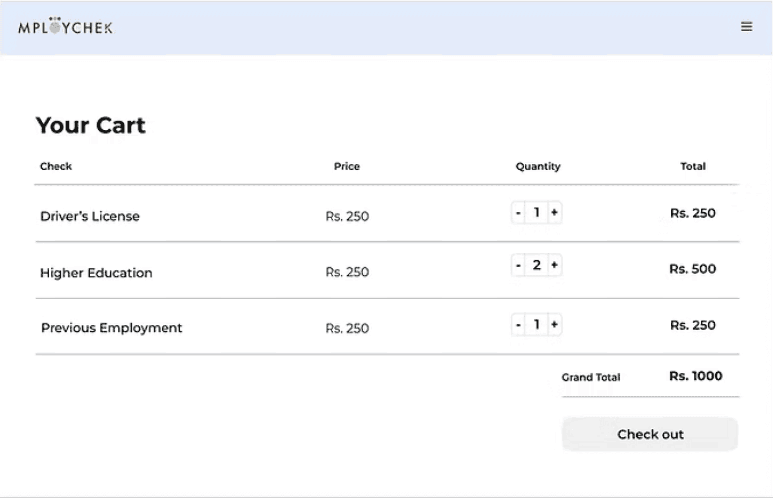
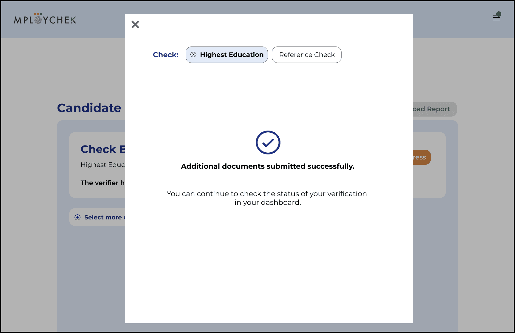
3. A payment step had to be incorporated into the new flow, as self-initiated users were now being charged to get their credentials verified.
User flow
The next stage involved creating a simple user flow on Figma showing all the steps a self-initiated user would have to follow, assuming the final goal was to download a PDF report containing a list of their documents that had been verified. This flow begins in the MployChek web app, which they enter after creating an account in the MployChek website, which I was not primarily involved in creating.

Then I proceeded to create a more detailed user flow of the steps a user would have to follow to complete the verification process, including uploading their documents/information, making the payment and downloading their verification report.

Iterating on the user flow


Process: Wireframing and Prototyping
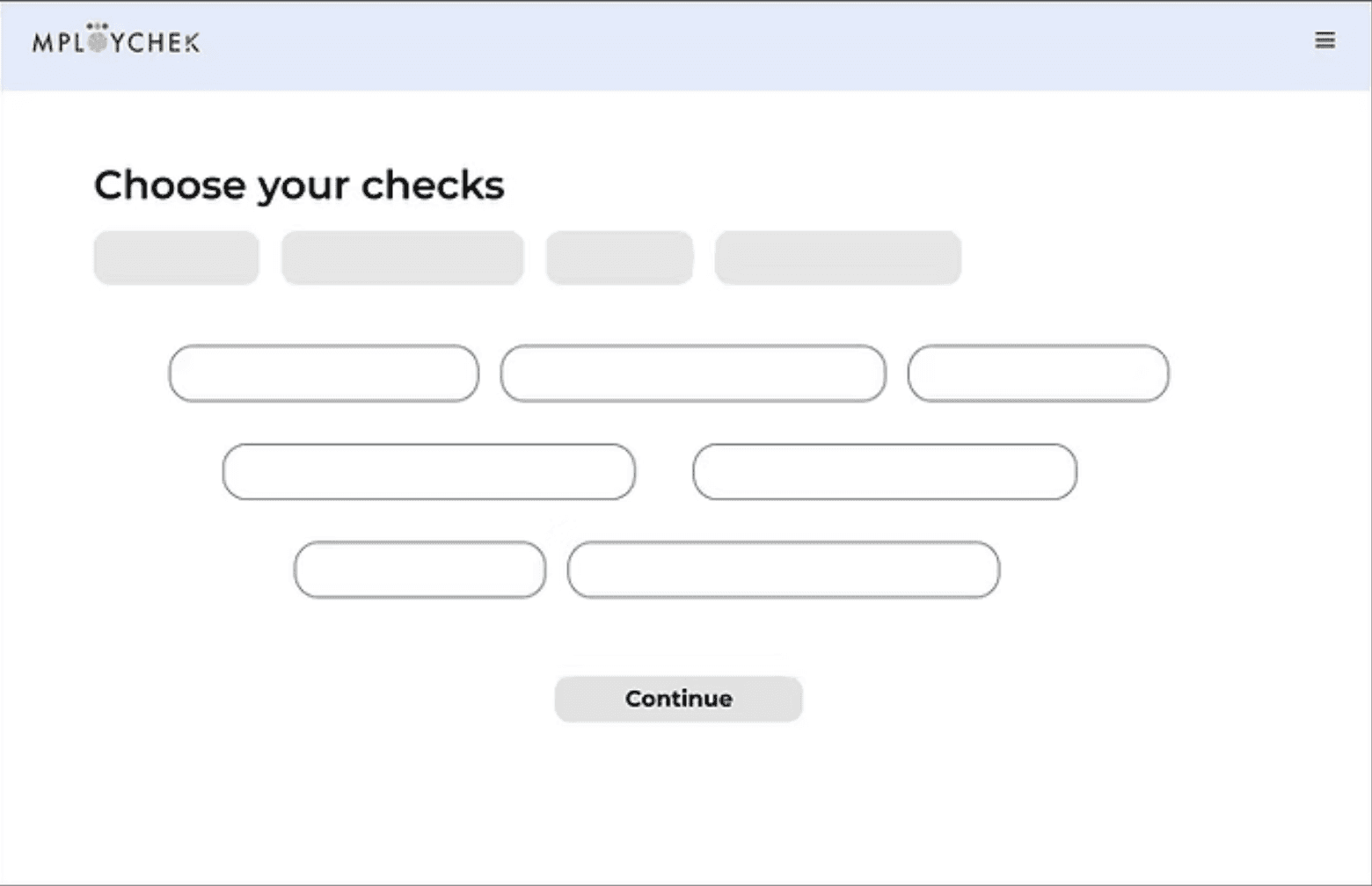
Low and medium fidelity wireframes
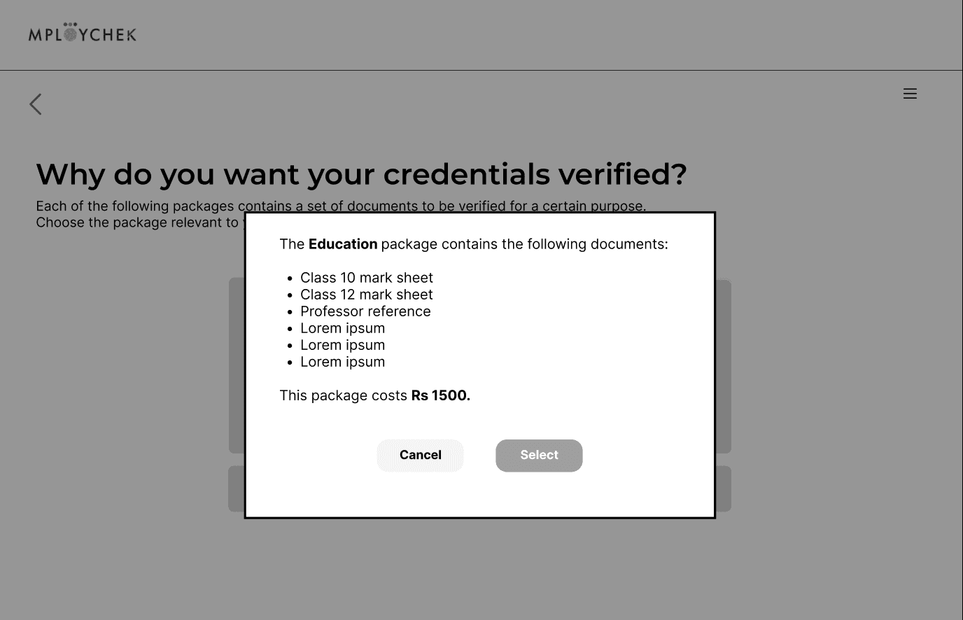
The wireframing process was iterative- I created low and medium fidelity wireframes based on the user flow, which changed occasionally based on new input from the company heads.


Process: Wireframing and Prototyping
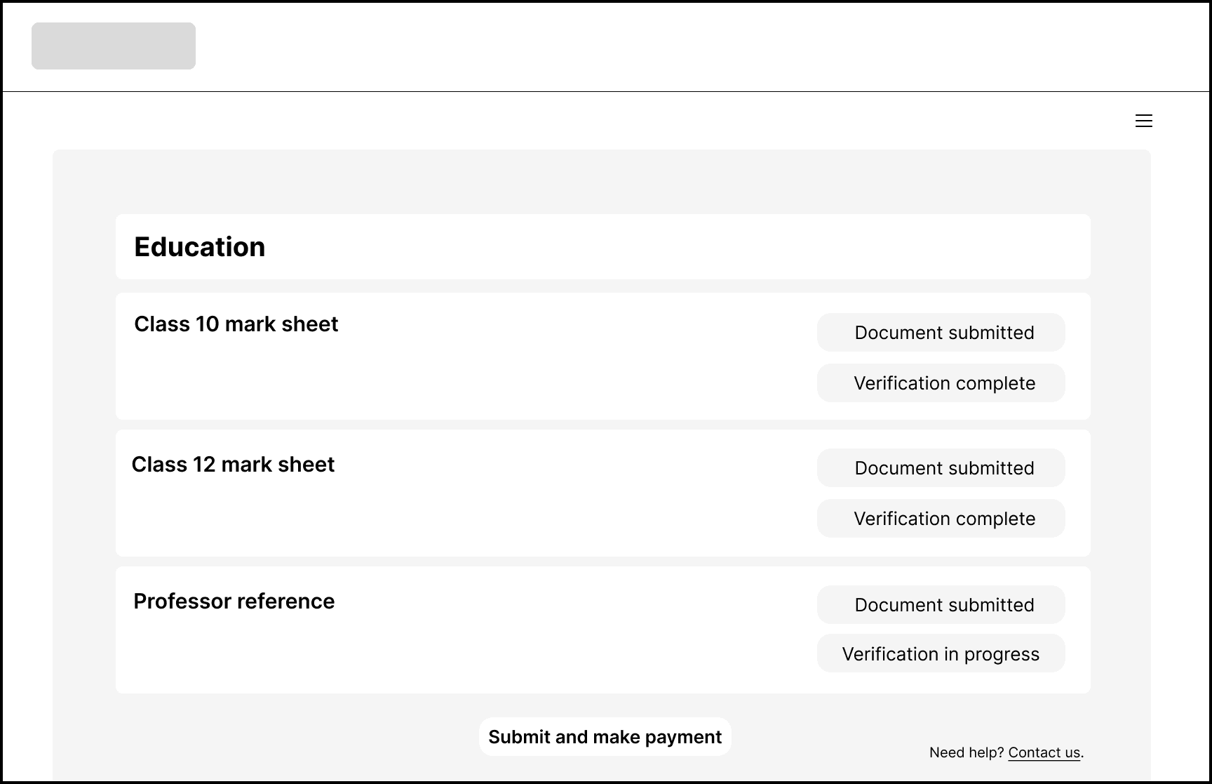
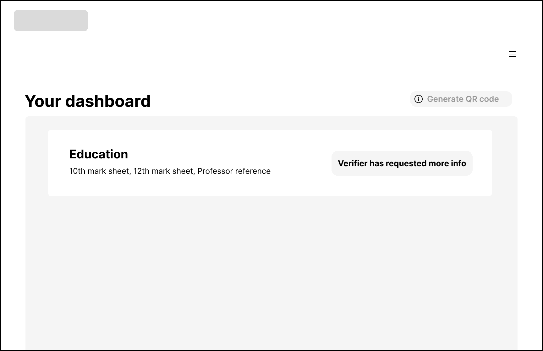
High fidelity wireframes
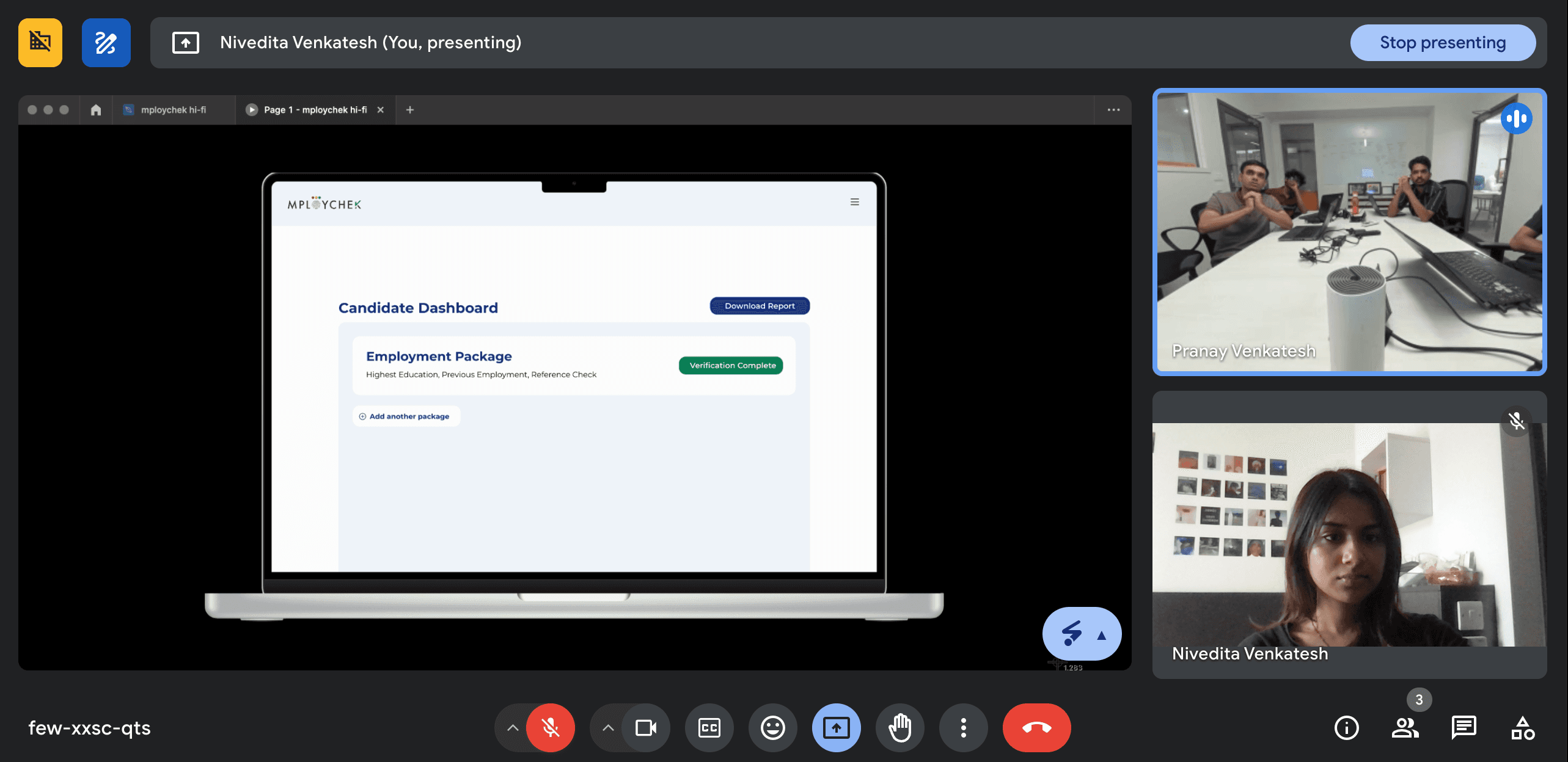
Once the candidate flow had been finalised by all the relevant stakeholders, I proceeded to create a high fidelity prototype to be handed off to the developers (this is a video; click to play)
Conclusion
My takeaways were as follows:
Cross-functional collaboration is key to creating a successful product: I learnt that while it is tempting to work in a vacuum, where anything you can imagine (and Figma can handle) is possible, a product can only be successfully launched if all the people involved in creating it (developers, project managers, executives) are communicating with each other and are on the same page!
Iterative feedback is immensely useful: Even minor suggestions from team members who weren't deeply immersed in the design process led to significant improvements in the user experience. I realised the importance of fresh eyes looking at a design.
Not everything will turn out exactly as you imagine and that's OK: I found that learning to reconcile technical constraints, business goals, and optimal user design requires flexible thinking and strategic compromise to ultimately create a useful product.

